
Happy Hump day! Well, it's at least the start of it here in California. Yesterday was...lame. I spilt coffee all over my keyboard at work and now I have irritating stickiness on a bunch of my keys, polish I ordered that arrived today arrived with a broken bottle that spilled all over the other polishes, and I'm just dealing with some person things that is making me feel like the day is a bit of a joke. I'm ready for the weekend! I've got family visiting starting Thursday night :)
To make up for yesterday's not so vintage-y look, I went (what I think is) very vintage tonight. I did (another) funky floral print! In my day one post I mentioned that I was inspired by this website (Q is for Quilter) and I've again found a 1930's print from that site. I quite like how this turned out!

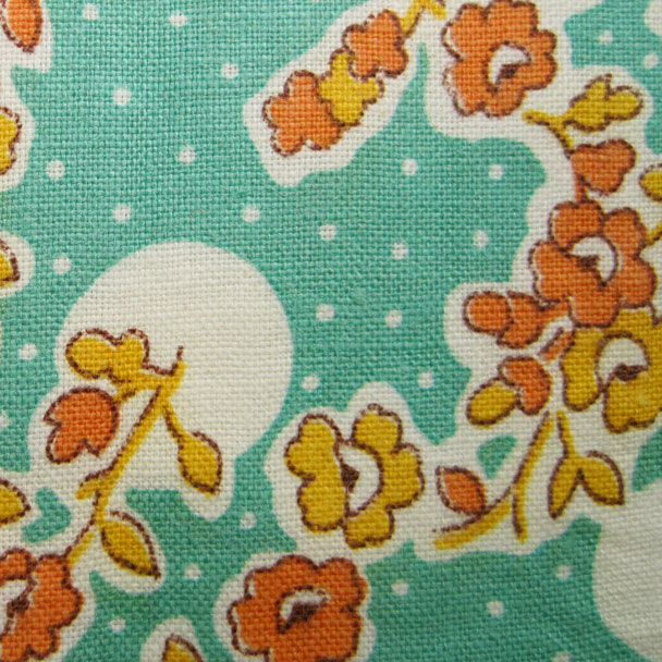
I think the color palette of a vintage print is so unique. I don't know how to describe some of them aside from calling them ugly-pretty? Does that make sense? A lot of patterns used burnt oranges and yellows in unconventional color combos and I think they are very indicative of a retro time. They are definitely not for everyone, but I love my ugly-pretty colors so much :)


I started out with a base of Zoya's Wednesday (I went back and forth between Wednesday and China Glaze's For Audrey, but they're so similar I decided it didn't matter and I really like Wednesday's formula). Using my detail brush, I first painted on the orange and yellow flower shapes (OPI's In My Back Pocket and American Apparel's Manila, respectively) and let them dry.


With white acrylic paint, I traced the outline of the flower shapes in a rough way. I considered painting the white first then adding the orange and yellow, but I lack the foresight to be able to know where each petal is going to go over the white. Using a dotting tool I added in the white dots on the teal background, and finally, using a burnt sienna acrylic paint, I outlined the flowers and leaves as best I could. I like the rough quality to the outlining.


Somehow, I think these almost look like decals. I think it's the white background? Either way, I really like how these turned out. They're funky and different but I definitely think they are vintage. What do you think of these? I'm sure there will be more florals happening this week so get ready!

Happy polishing and check out the other ladies in the group below! :)


